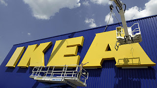
Font Wars

Given my somewhat bizarre interest in fonts, this article from Time Magazine caught my eye: "The Font War: Ikea Fans Fume over Verdana." It appears Ikea is scrapping its customized Futura for plain-jane Verdana, which designers are in an uproar over because Verdana was always (and, as they sigh, obviously) intended for on-screen use and not print use. Here's an excerpt from the article:
Carolyn Fraser, a letterpress printer in Melbourne, Australia, adopts a different metaphor to explain the problem. "Verdana was designed for the limitations of the Web — it's dumbed down and overused. It's a bit like using Lego to build a skyscraper, when steel is clearly a superior choice." Others seem mystified by the choice to eliminate one of the chain's key identifying features. "The former typeface definitely better reflected Ikea's design philosophy, giving it a very special, unique flavor that actually fit the company's style," says Vitaly Friedman, editor in chief of the online Smashing Magazine, which is dedicated to Web design. "With Verdana being used all across the Web, Ikea's image not only loses originality, but also credibility and the reputation that the company has built since the 1940s."
Here's another excerpt:
"They went cheap, in other words," counters Bucharest designer Iancu Barbarasa, who blogged about the font change on his website. If he sounds somewhat bitter, there's a reason. With its attention to the curve of even a $9 lampshade, Ikea has become renowned for its understanding of good design. "Designers have always thought of Ikea as one of their own," Barbarasa notes. "So now, in a way, the design community feels betrayed." Indeed, the desire to remind people — and corporations — that design matters is what spurred design consultant Ursache to start a petition asking Ikea to do away with the offensive Verdana typeface. "Look, I know this isn't world hunger," he says. "But if a company like Ikea can make this mistake, you have to wonder who is going to lead when it comes to design."
Um, isn't that the whole premise of Ikea? That cheap and simple and common IS chic? I like what the Ikea spokesperson had to say about the decision: "It's more efficient and cost-effective. [Because it is freely distributed by Microsoft and can therefore be easily used across countries and alphabets.] Plus, it's a simple, modern-looking typeface." Imagine that: simple and modern-looking. Sounds like a timeless design approach to me.
Comments
To use a font designed exclusively for the screen as a component for corporate identity and marketing goes completely against that. Using a common typeface is fine, but it should be the right one for the job.